10 April 2020

Interesting coronavirus charts

When I first learned about arithmetic multiplications at school, I loved it so much that I would force myself to solve even more complex operations (e.g. 123456789 x 123456789) while waiting for Mum to prepare lunch. I can still remember scribbling as fast as I can on the corner of the kitchen table. I have loved numbers ever since, in the form of metrics or charts. In this article, I’ll share some of the graphs that I found most interesting in relation to the coronavirus pandemic.


Infections and death tolls

Infections in the world far outpacing those (officially) recorded in China (source)

Deaths outside of China – a visual representation by major geographic area (source)

The estimated “real” rate of death due to the virus by comparing the current death rate (across all causes of death) and the historical average (source)

Another perspective at the “real” death rate (source)

How the US and UK obviously messed it up (source)

Causes of death in NYC (source)

Switzerland is spending 18 times more on healthcare per inhabitant than Romania


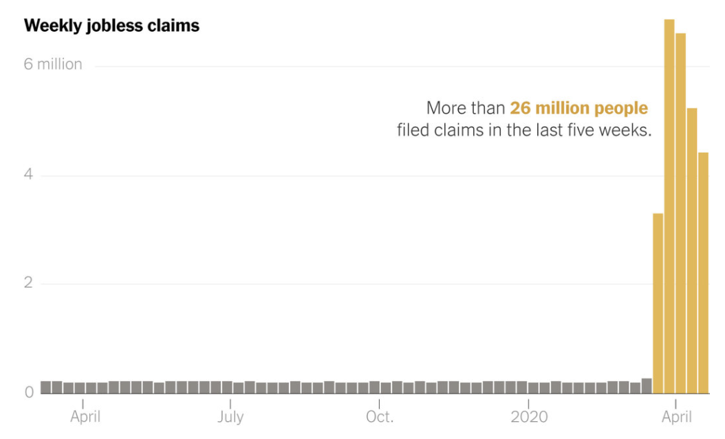
Effects of the lockdown

Countries in various states of lockdown (the darker the colour the more stringent the lockdown) (source)

Number of flights actually happening (red) and initially planned (blue) before and after the lockdown in France’s 10 biggest airports (source)

Evolution of number of flights in various countries vs. 2019 (source)

Noise levels between 10pm and 2am in 3 areas of Paris before and after the lockdown (source)

There’s so much petrol produced while demand has crashed and storage is full that you are now paid $40 to collect a barrel of petrol (on the US market, as per the West Texas Intermediate benchmark, not the international benchmark) (source)

26 million Americans filed for unemployment over 5 weeks, the highest weekly and 5-week figures ever (source)


Mobility trends in Italy (Google Mobility Reports)